One of the most frequent questions people ask Campus Designer Kim is, “How do you come up with all these ideas?” While not diminishing the rich wealth of my makeover teammate’s immeasurable input, part of my responsibility is pushing through each and every series, assuring I’ve collected the pool of creative thought neccessary to dream and build an engaging stage. I do “come up” with a lot of the ideas, but for me it’s more like taking time to sit inside the graphics Greg designs – asking myself what metaphors, colors, shapes, materials and elements this series might hold.

For instance, our HAPPILY EVER AFTER? graphic above is blue and white with a grey-ish design in the backscreen. The background looks a lot like wallpaper to me with the HAPPILY EVER AFTER banner having the appearance of torn paper. Early on i knew that these various elements that would make their way into the stage design. I just didn’t know how. Truth be told, my brain was a bit FROZEN last month and I spent a record amount of time wandering our local craft supply store.
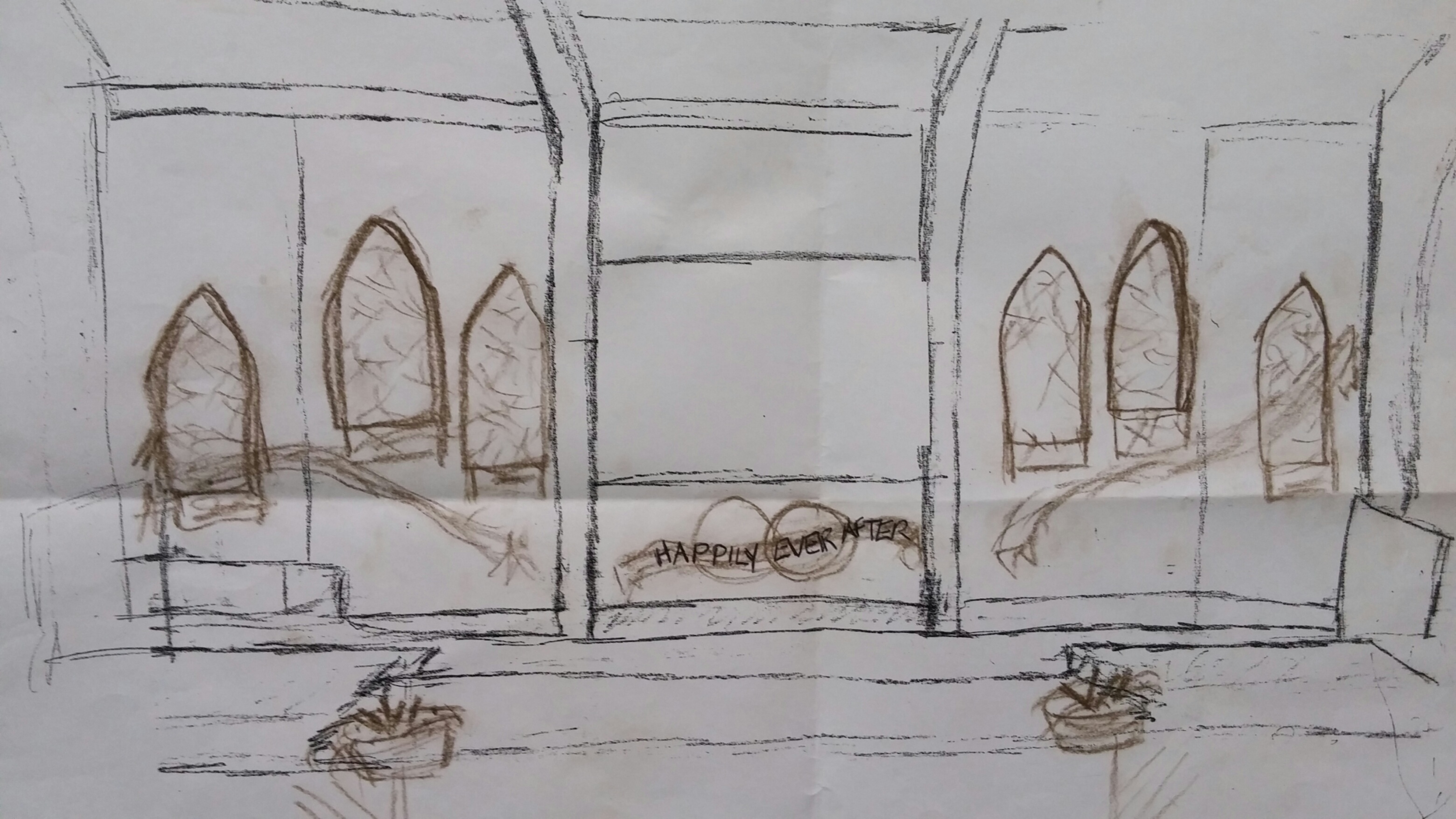
In time a sketch was born. Sketching out what’s in my head is imperative to our makeover team. People always need to see the vision before they can help create it! Needing a large-scale backdrop, I included arched window outlines, giving a wedding chapel effect-
(marriage = wedding = chapel, get it?)
We cut the windows out of 4′ X 8″ sheets of 2″ foam from Menards. One of our artistically gifted teammates then spray-painted several neutral shades of paint onto the foam-cut windows, using metal scrollwork pieces as stencils to give that floral wallpaper look and added depth to the six foam windows.
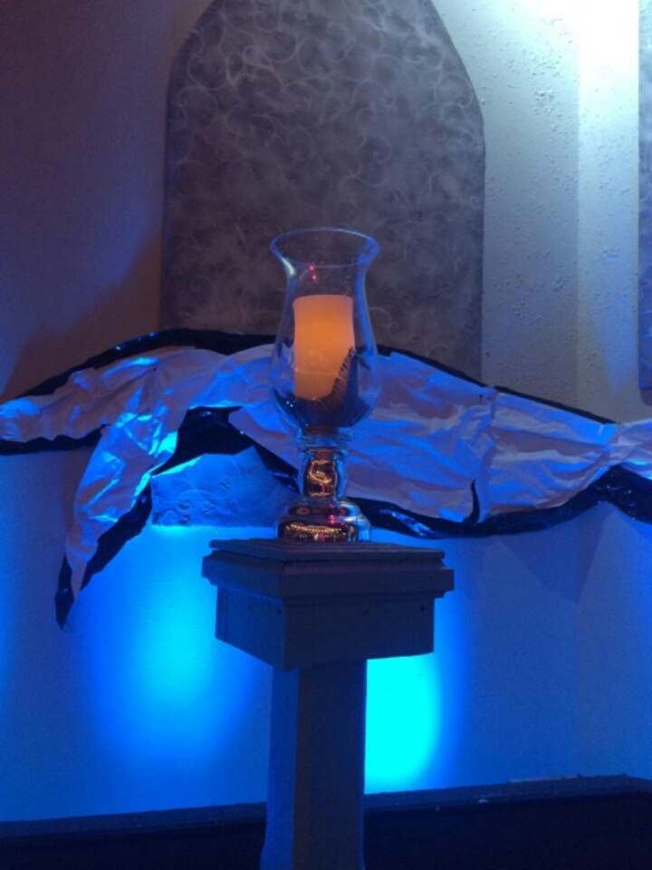
Every stage design we use what I call “stage pieces” scattered strategically across the stage floor to lend a second layer of depth to our design. This time we pulled out old porch posts – turned candle stands and painted them turquoise to match the look of the series.
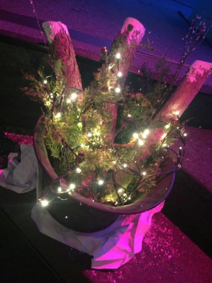
For a second “stage piece” we pulled out four metal buckets and filled them with frost-painted logs, pine greenery and branches of mini lights. I like keeping just a taste of the holidays to tide us over through the dreary winter months. We sat the buckets on crumpled white paper to help integrate with the back stage walls and make the buckets pop.
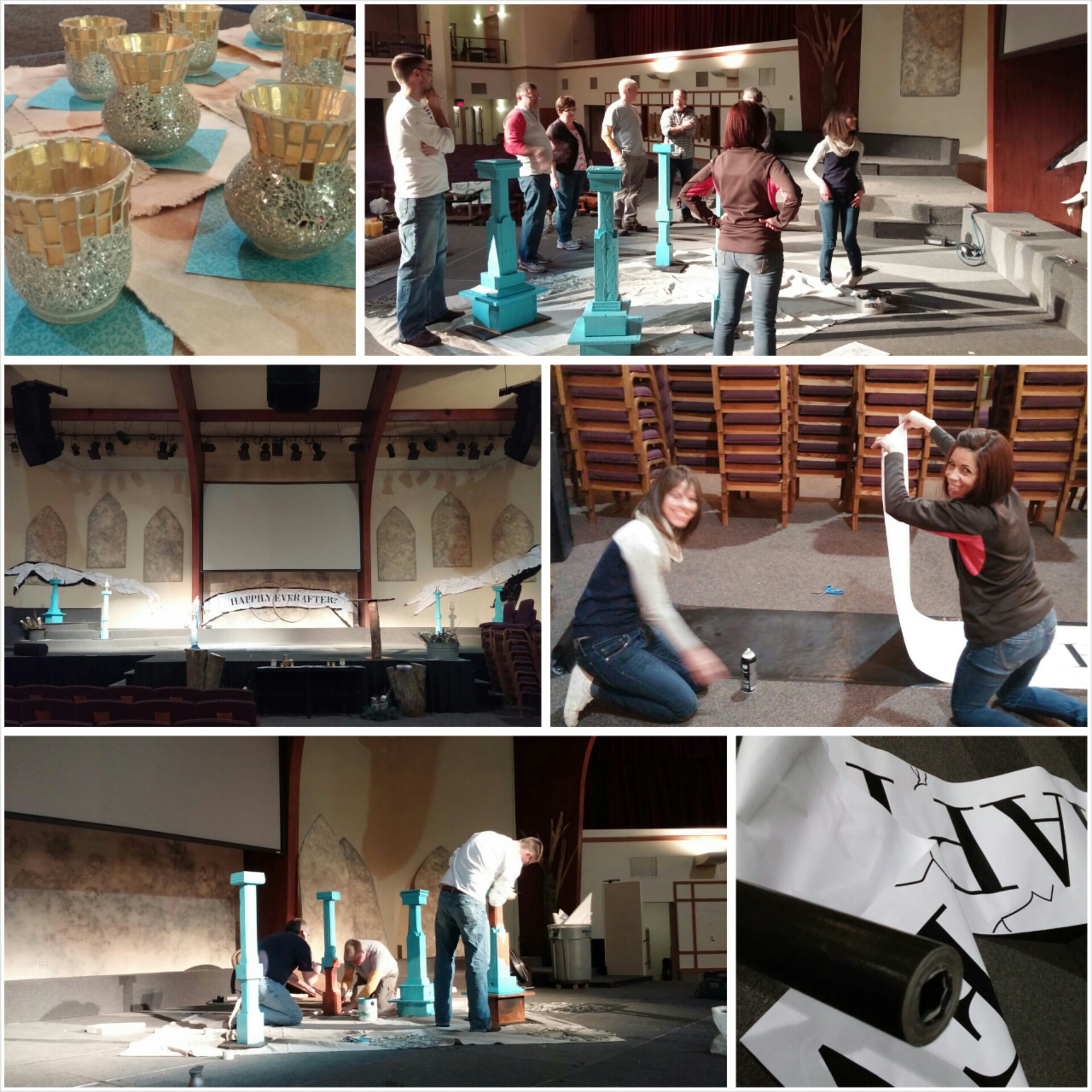
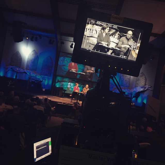
Less than a week after our huge Christmas Eve celebrations this team came to dismantle Christmas – and the very next night were back at it again building our new set. My favorite moment was captured in the top right photo above… teammates pausing to scratch their chins and contemplate what exactly HAPPILY EVER AFTER could possibly mean. IS there such thing as marital bliss??? Hmmmmm……
Lots of painting, printing and paper crumpling happening. Did you know you could purchase BLACK butcher paper? It’s true. We wanted to offset the white poster printer paper with a slight bit of black to help it… um, POP.
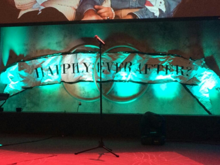
The wooden rings above were a donation from long ago – formerly stained glass window frames.
Why not use them in our design?

I don’t like spelling out the theme titleword ALL the time but for this series it worked. It made a particularly rich background behind our weekend speakers – who were Mike AND Carolyn Slaughter this past weekend. They did a slam-dunk job sharing about Divorce, Remarriage and Redemption. It was relaxed and refreshing.
Ah… Dan Dan the Media Man… always trying to get into the pic <3
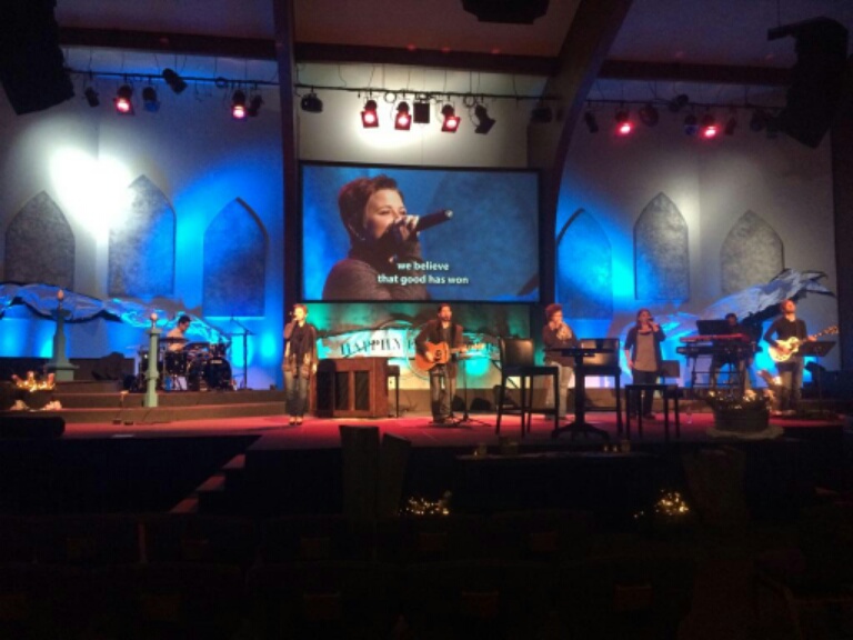
Full stage effect. Our band has done some MUSIC this series. Seriously great versions of our favorites – everything from I Will Always Love You to All of Me to My Cherie Amour to Say Something. Incredible work and we’ve loved it!
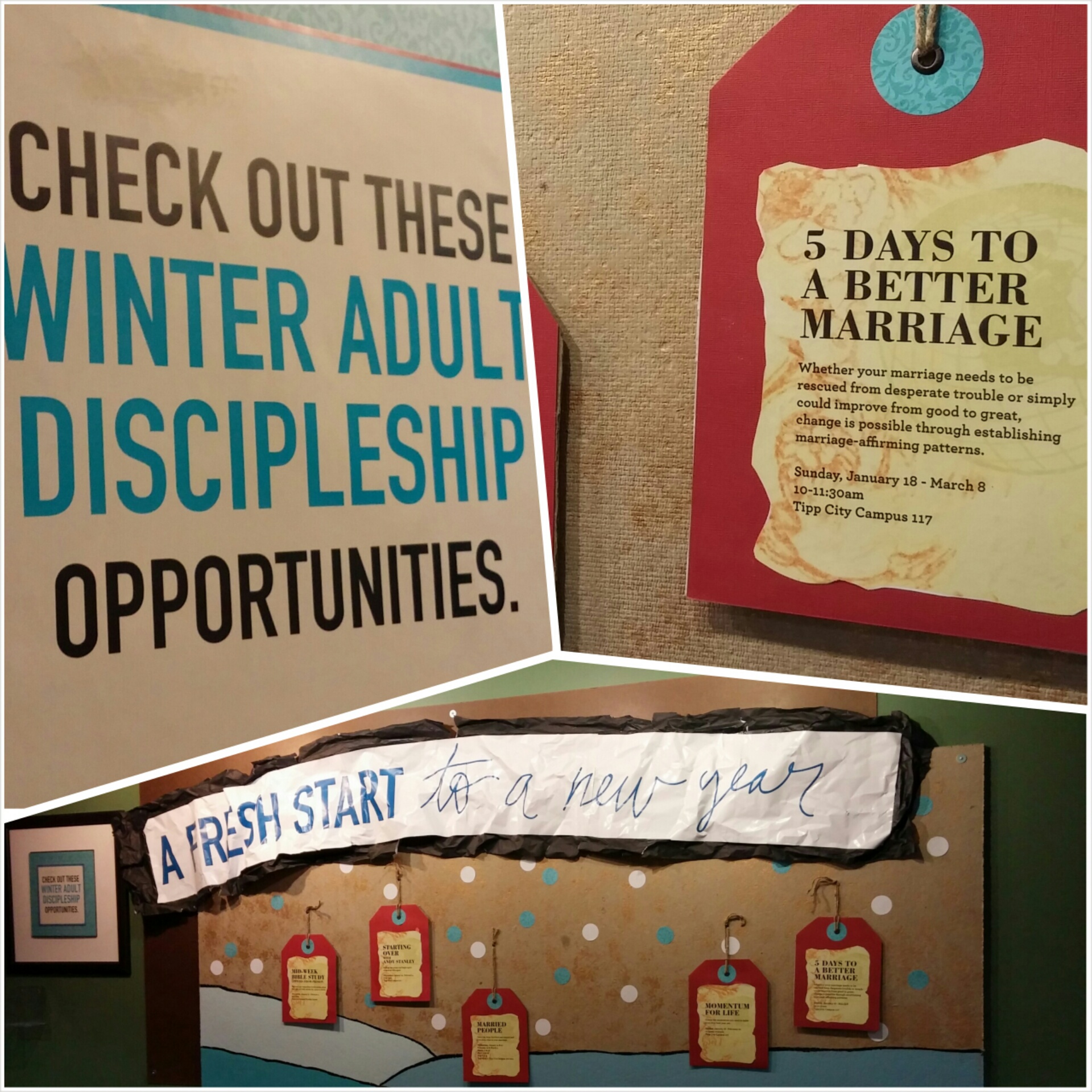
And where would the hurting marriages be without classes and opportunities for healing and fresh starts? We created a display board in our lobby to highlight current classes using a similarly themed look. This wall features a 4′ X 8′ piece of masonite background with a 4′ x 8′ piece of homasote overlaid. We’ve changed the design on the board several times and really like the fresh notice it gets when new messages need to be communicated. Why relegate great design to your worship space?
So there you have it. A seven-week series designed for lifetimes of marital bliss 🙂 Total cost: foam-$24, spray paint $30, scrollwork for stencils- $30, roll of black butcher paper- $12, marriages saved and strengthened- PRICELESS.
Check out the messages online and feel free to use some of our ideas for your next design.
Simply beautiful!!!! When I grow up….
Awesome as usual:)