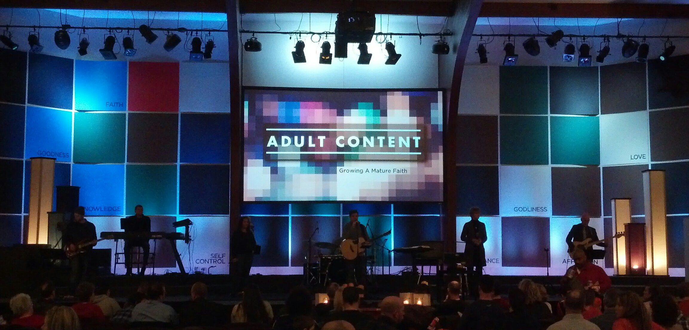
It’s an eight-week series to kick off 2014 – all about growing up into spiritual maturity. We called it ADULT CONTENT and each week of the series addresses one of the listed attributes from the first chapter of the New Testament book of 2 Peter:
…For this very reason, make every effort to add to your faith goodness; and to goodness, knowledge; and to knowledge, self-control; and to self-control, perseverance; and to perseverance, godliness; and to godliness, mutual affection; and to mutual affection, love…
![AdultContent[3]](http://redesigningworship.com/wp-content/uploads/2014/02/AdultContent3.jpg)
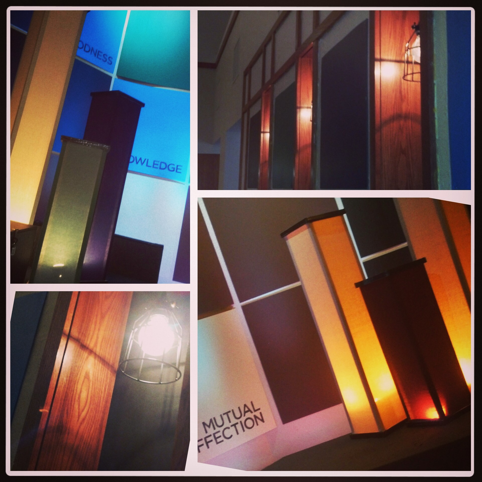
Taking cues from our main graphic comprised of pixilated boxes i created a schematic of the stage and how many squares of each color we would need, then ordered Coroplast (corrugated plastic) in the available colors closest to the graphic’s blend. Since Coroplast comes in 4’X 8′ sheets i asked they be cut in half to give us 4′ squares. Later we would cut some 2′ squares for the side walls and our two satellite campus stages. On Makeover Day we stapled the large squares to our stage walls and side walls of the room with careful measuring and spacing between. Oh- and we stenciled the eight weekly theme words to various squares on the grid as an extra layer of interest.
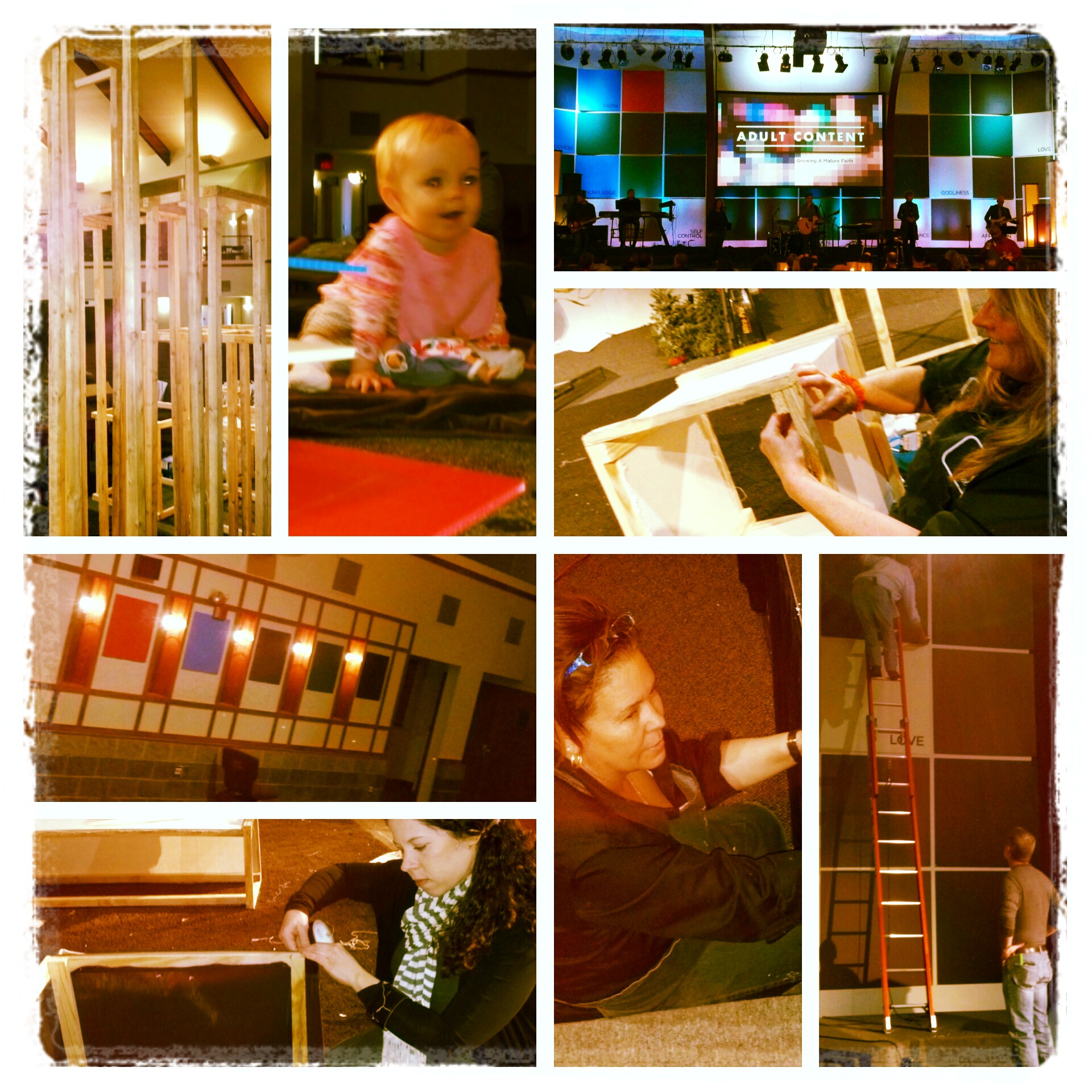
Additionally we added light boxes – six different sizes, wood-framed and covered with cloth (stapled). Since the wood frames were exposed at the top and bottom we covered those edges with black duct tape (5 rolls!) to lend a sharper look. Inside each light box we clamped a simple work light (about $6 each at any home improvement store.)
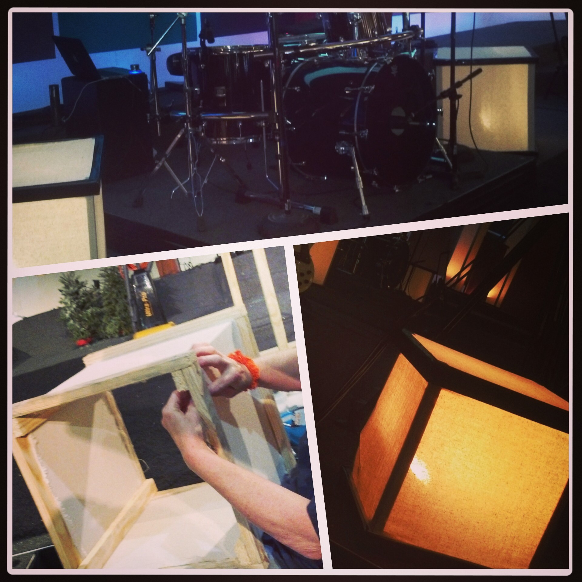
in our side wall window boxes we suspended simple pendant bulbs (already had these from a previous stage design) with “cages” clamped over them. I found the cages at the home improvement store as well – thrilled at their low price since Anthropologie has a VERY pricey version with a higher pricetag for one lamp than the cost of our entire makeover.
Typically we don’t spend much REAL money on a stage design but it made sense for this series because 1) it’s twice as long as a regular series 2) we created enough pieces for three campuses and 3) all the materials can be used many times over. I’ve already had three different requests to use the squares in various ministry venues. SCORE.
We’ve gotten a lot of positive comments on this design, remarkably more than usual from GUYS. Must be the geometric lines??? Not exactly sure… 🙂
This is just too cool! It’s geometric and fun but not distracting, plus I love that it reminds every one of where they’ve been and where they’re going. Love it.
Awesome design. What a cool series graphic too! Who did that, I love it. Extending the pixelation to the wall… such a cool thing.