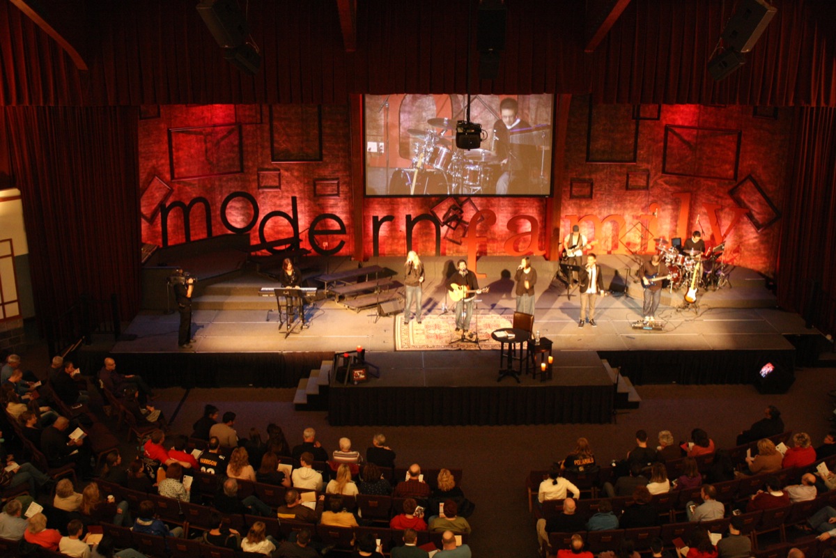
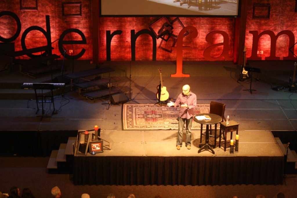
modernfamily: the genesis of relationships
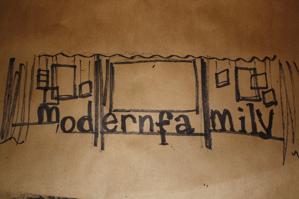
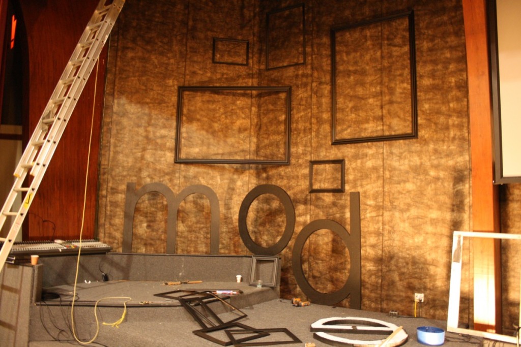
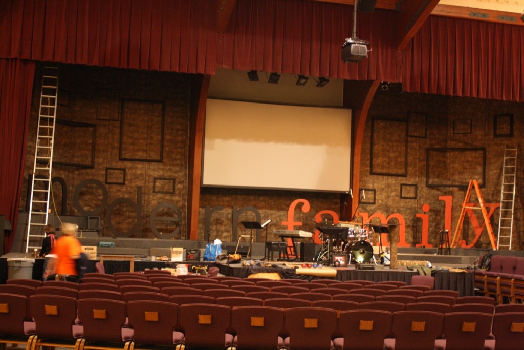
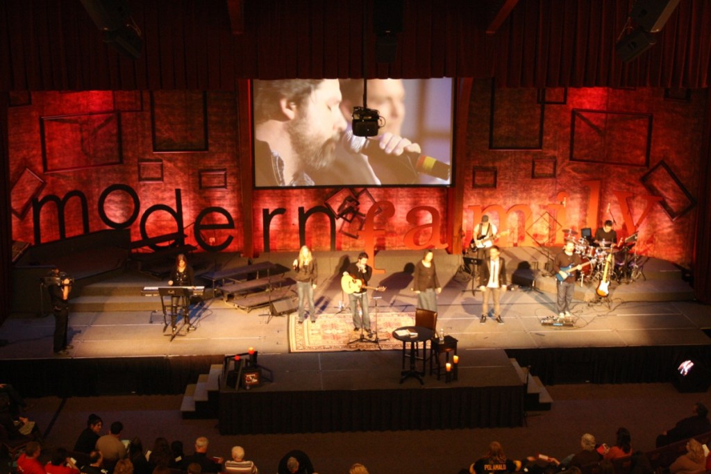
our stage design for this new year’s series began with a sketch. “nothing happens but first a dream…”
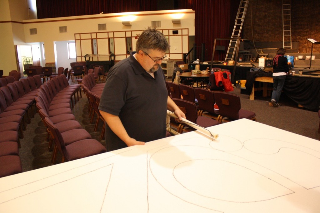
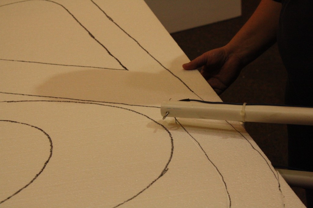
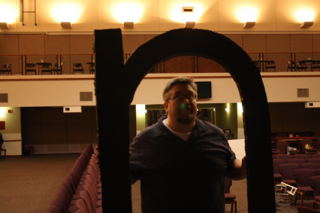
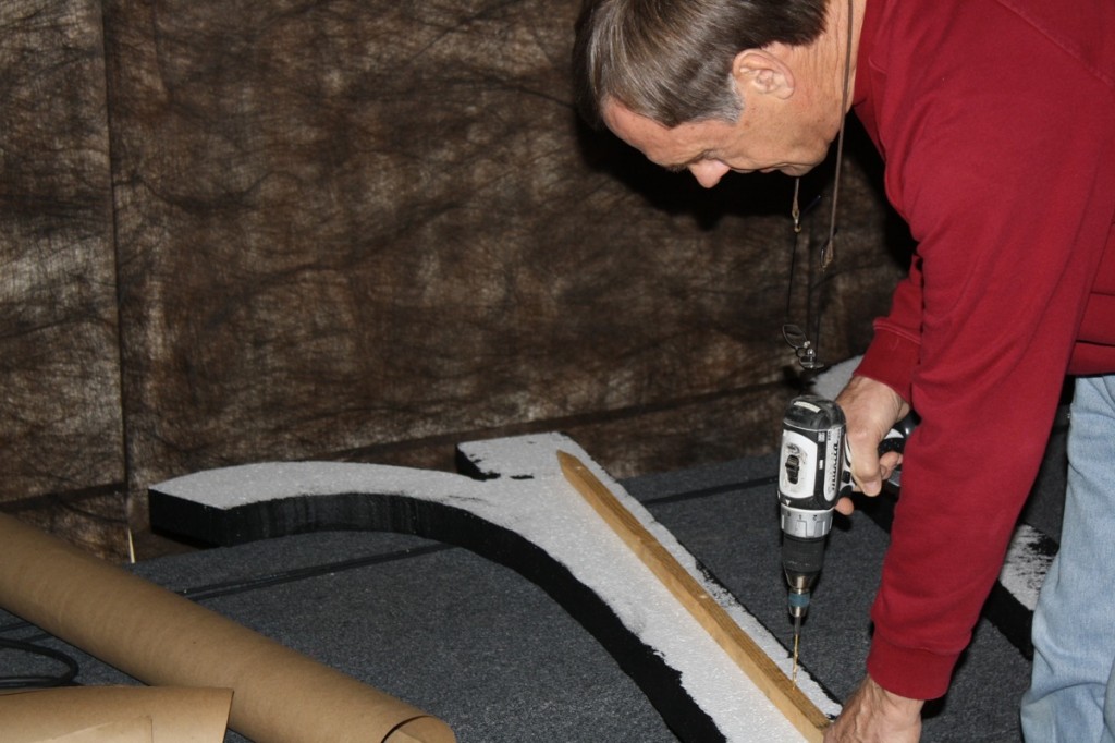
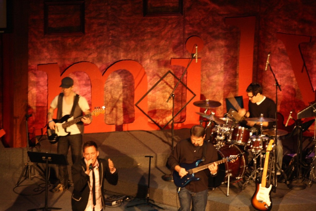
using patterns from the series font and an overhead project we traced 3’ x 4’ letters onto 2” styrofoam insulation (www.menards.com) and began cutting with our homemade “giant cheese cutter” as I like to call it.
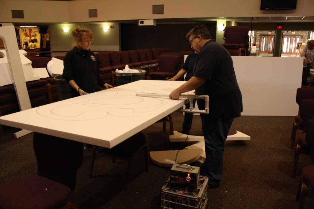
chad made our cutter using an electric box, pvc pipe and wires. you could do some serious damage with this tool but it’s great for large projects.
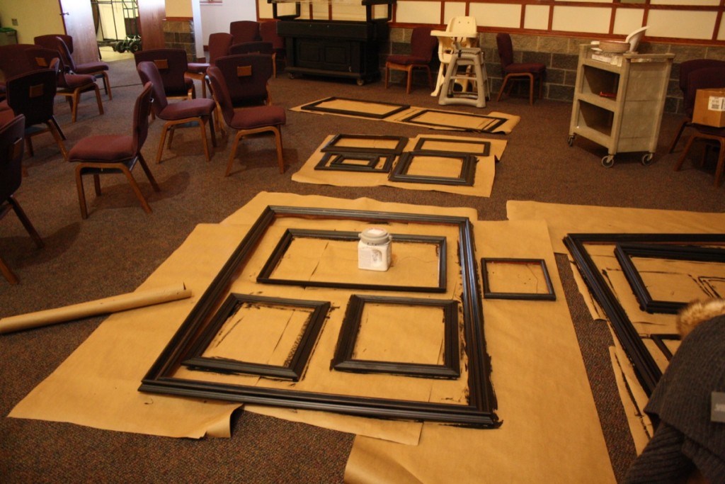
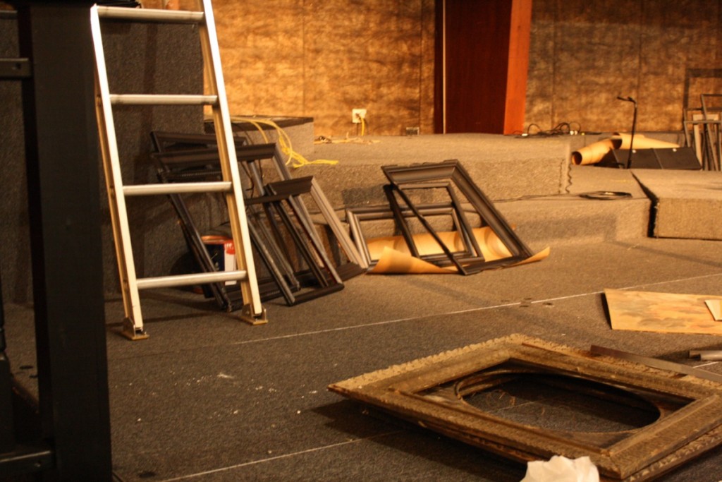
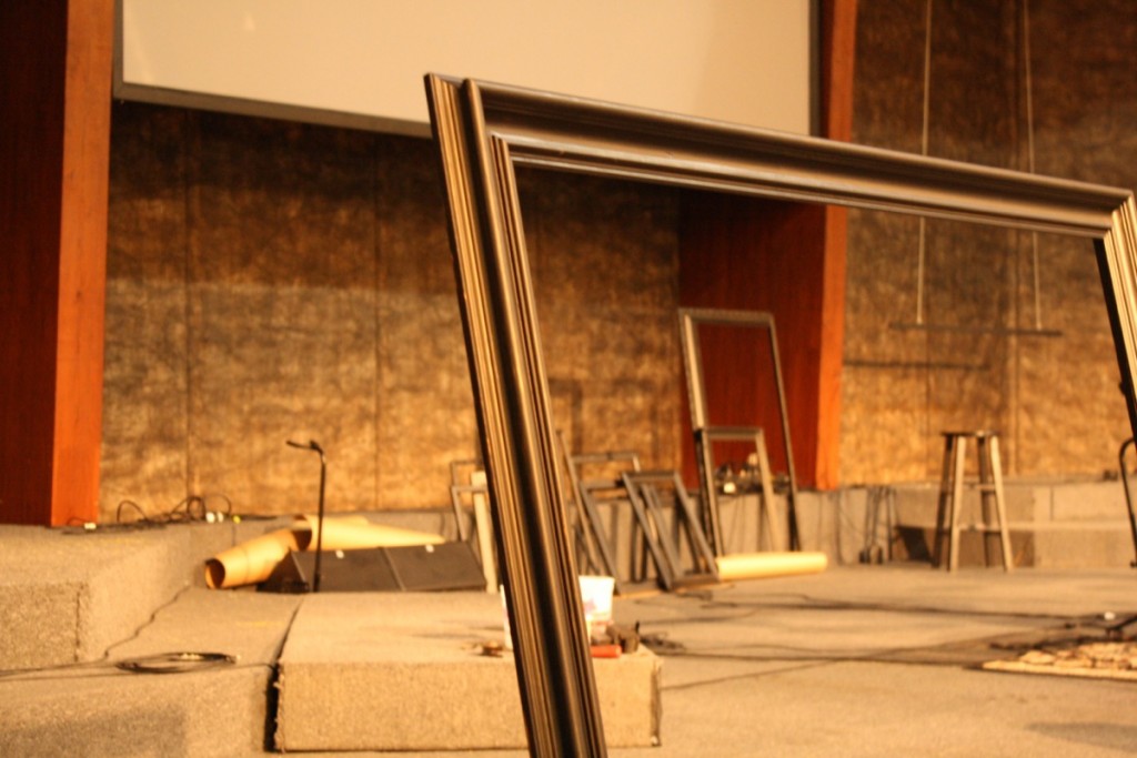
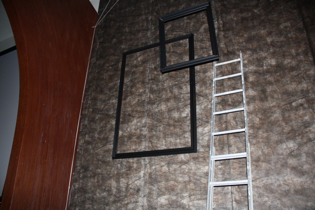
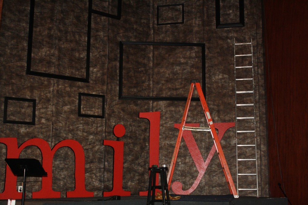
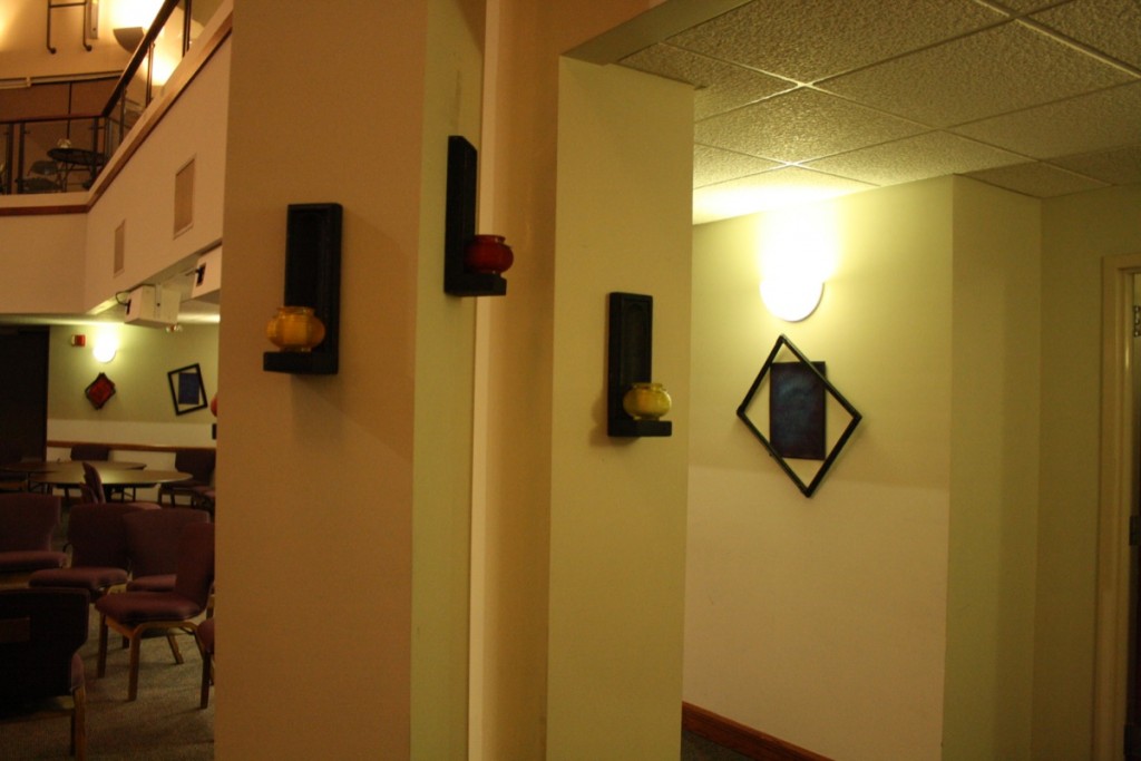
early in the month i’d put out a call for old frames we could paint. we got a great response. add a can of black paint and we were on our way.
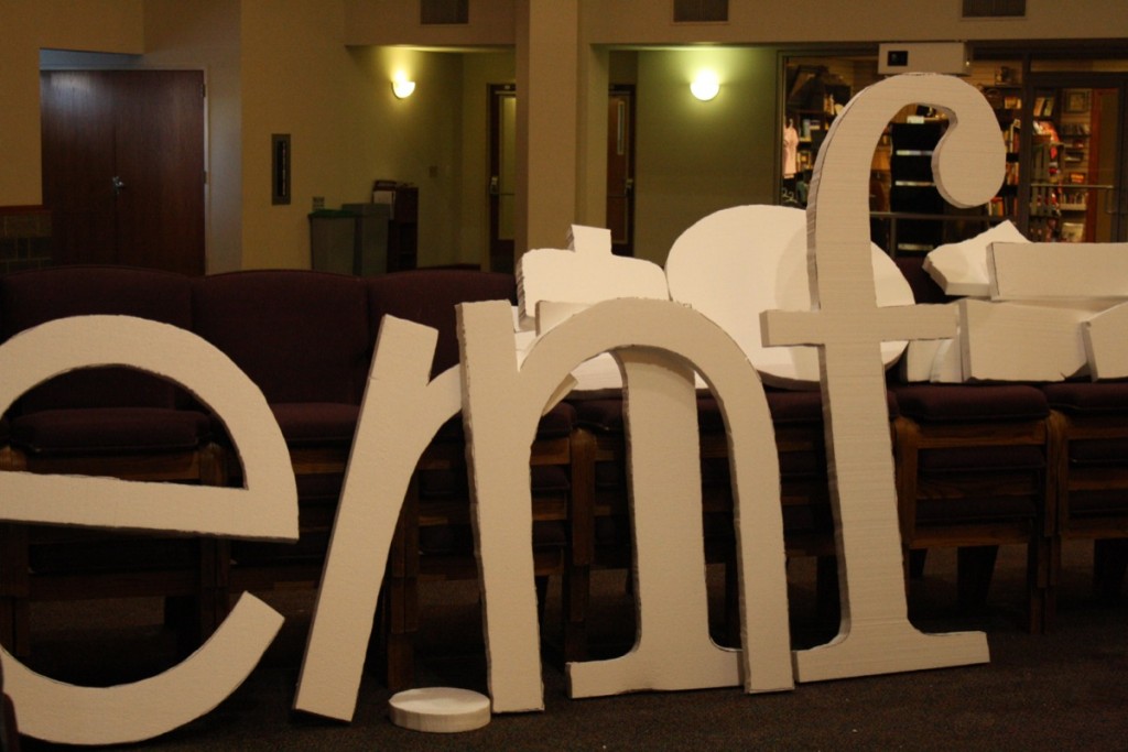
meanwhile back at the letter cutting station we are making progress. “modern” and “family” are two different fonts, fyi. details matter!
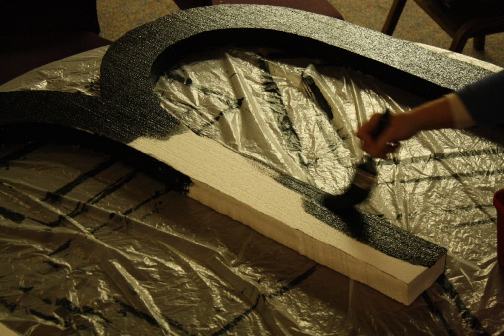
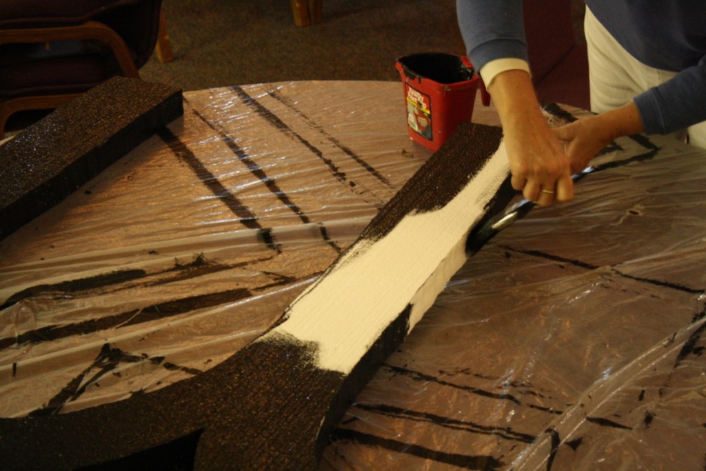
next up- paint the letters. we didn’t use spray paint because it eats the foam – plus, baby, it’s cold outside! #fumesmakeyoucrazy
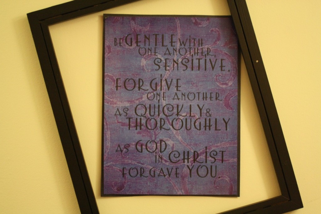
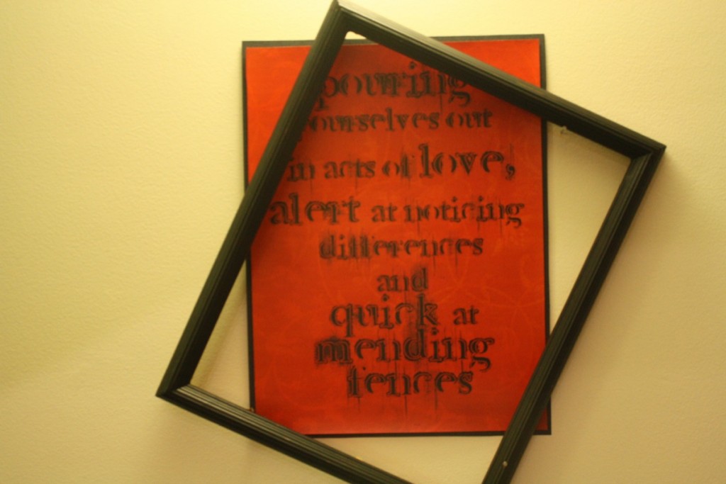
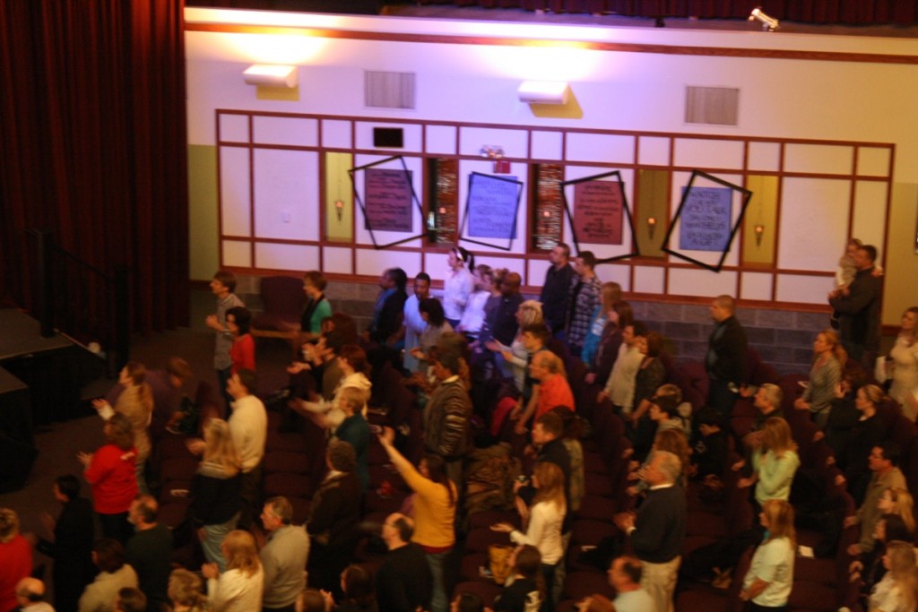
another feature of this design, family-friendly scriptures from the message stylized and formatted to enhance worship area walls.
