two worship series have blown by ginghamsburg church without much sharing. hi. i’m debra, a scribe/reporter for kim miller and her incredible stage and event design team. they’ve been so busy creating, that documenting and communicating need to be caught up.
a series for pentecost and community
based on the book of Acts, this was to be a series on the Holy Spirit. the timeline also included our teaching pastor’s debut and he (nick cunningham) was excited to focus on community. so, it ended up being a series on how the Holy Spirit impacted the community of the early church. pretty cool…and lots to work with.
inspiration for the stage design came from dan bracken’s graphic; the lines within it were worth imitating. without feeling angular or geometric, the graphic gave us the impression of movement.

design development began by taking a look at what was in hand: lots of gauzy fabric. when pulled out of storage, the team found that there were just a few long pieces and lots of shorter ones. the gauze would need to be supplemented and enhanced with rope.

gauze fabric & rope doodles were stapled to the wall
challenged by how to hang the fabric so that it looked flowing, the team got into a rhythm of attaching it to the back wall with staple guns, knotting the ends, and creating large swoops. spaces were filled in with doodles of rope design. the final touch was the addition of the quietest, least expensive fans that lowe’s had to offer. as usual, when the l.e.d. lighting was designed, it took on a life of it’s own. adding cool teal to the color scheme enhanced the feeling of the summer season.
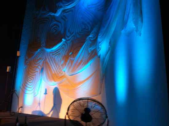
fans provided gentle movement of the gauze fabric
about those fans: kim advised all of the worship teams and crew that there would be a little extra stage noise…in advance.
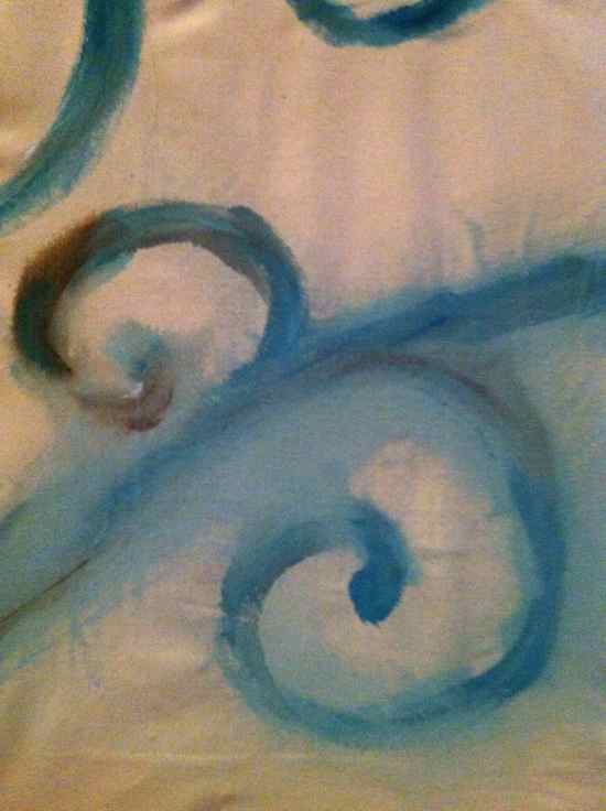
fine artists painted more wind on pieces of canvas that covered the side walls. $20 neutral tone ikea designer rugs thrown across the stage really lighted up the space.
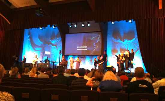 this 9 week series included 2 communion weekends. kim re-arranged stage candles and stands each week, to compliment musician positions. overall, this was a very accommodating design that brought freshness into the worship space.
a few more photos from the series…
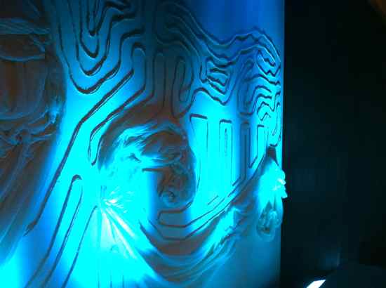
led lighting gave the fabric and rope a great teal tone
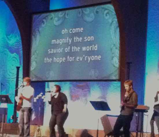
a mighty wind graphic for song background
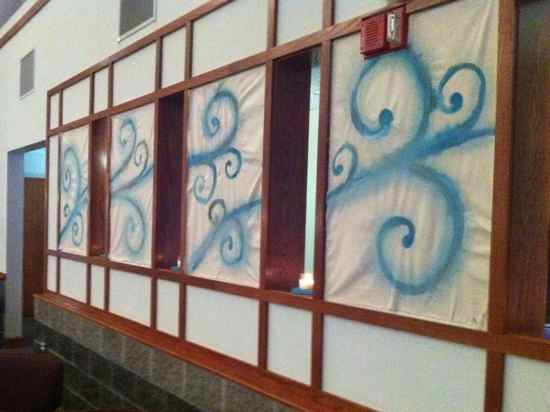
canvas covered wall panels painted by the team's fine artists
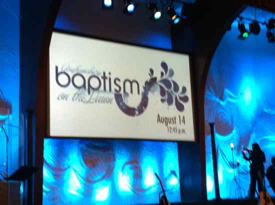
theme carried well through a baptism on the lawn event
let kim know if you can use any of these ideas…or want more information. comments are most welcome!
coming up next: the series on prayer: omg
Pingback: Topography | Church Stage Design Ideas