It’s no secret that most churches are somewhat “communicationally” challenged. And by that I mean that we struggle to create engagement, both with the “outside” world and with those inside our congregations – and Ginghamsburg is no different. We struggle just like others with what to post, what to announce in worship, what warrants weekend bulletin real estate and what might be best communicated via posters and signs in the hallways.
While my advice to churches I consult with is to lose the old style bulletin boards (they feel very “insider oriented” and are generally not visually engaging) here is a modern-day version. I’ve recently created hallway display areas suitable for [temporarily] communicating an initiative, a resource, a worship series complement or, as featured here, an invitation. Messages in public spaces directed to the general population.
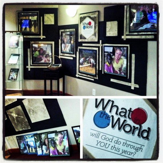
For this display I teamed with our Missions Specialist, Elizabeth Heft. Elizabeth gathered six great photos from recent Ginghamsburg trips. I gave our stellar graphics designer Tracey the specs for the spaces and she went to work captioning and formatting. IKEA sells great square poster frames that helped us along.
As an extra design element, canvas squares we’d spray painted and stylized for a previous stage design were attached behind the poster photos to help them pop. Torn strips of the same canvas accented each photo square. Additionally, we printed one “What in the World? text graphic that would serve to pull in passersby, then framed and displayed several pages from our recent trip options brochure to be housed in our handy IKEA display cabinet. Last of all a basket of brochures invited folks to help themselves to their own copy of the brochure – and the opportunity to choose their very own mission adventure.
What in the World will God do through YOU this year?

